Hi folks!
You might have found this blog because you've read a write-up about the Brosie the Riveter joke that my buddy Sam Kirk and I played at our company, the write-up of which was originally hosted on The Hawkeye Initiative. To our surprise and pleasure, it went viral. :) It wound up on sites like Kotaku, PC Gamer, and Wired. There's an interview with me up on Wired, too, here.
This is a blog I've used from time to time in the past. It has been mostly for data science rants, sometimes for silly things. The Hawkeye Initiative blog post was my first posting about gender issues. You can follow me on twitter, where I also post rarely, here: @K2_said. If you want to contact Sam or myself, you can do so through Twitter, through Sam Kirk's site, or through the Hawkeye Initiative.
I might blog/tweet more now! But man it takes up hella time.*, ** So we shall see.
--K2
* Including troubleshooting why some of the older formatting on this blog is hosed.
** Oh, you heard me right. I said: "hella."
Consummate Vs
Bringing you divergent rants since 2006.
Thursday, May 16, 2013
Artist/collaborator Sam Kirk on (ahem) Brosie the Riveter :)
Possibly
the most positive thing about this Brosie experiment – right up there with Mark
Long’s amazing response, and the internet’s equally positive response – has been
working with Sam Kirk. For the first few months after I had the idea, I didn’t
think I’d find an artist with the talent and the sense of humor to make it work.
But when I asked around, there he was, right in my own company! And Sam’s
involvement fundamentally changed the idea for the better. Beyond his raw
talent, Sam had this marvelous instinct for making the satire warm and friendly.
It was Sam who suggested the Meteor Entertainment cultural in-jokes that are
hidden in the picture. (For example, Brosie’s face is from one of our beloved
co-workers.) And better yet, Sam is fucking hilarious. For about a month
(late nights and weekends for Sam, which he did totally pro bono), we passed
proofs back and forth, drunk on funny.
Sam
and I share a lot of values, not only on gender politics (which is remarkable enough),
but also on the importance of collaboration. As such, I’d like to hand Sam the microphone
for a bit to respond to some of the same questions that WIRED asked me. Take it
away, Sam:
I'd love to hear your
thoughts about the reaction to the piece so far. Why do you think it's gotten
such a positive and viral response?
SK: I’m shocked by the scope and velocity of the reaction, but I’m
not surprised by the tone. We’ve seen this topic bring out the worst in people,
especially in venues that house cowardice the way comment streams can. Discussions
break down quickly when people’s sensitivities are threatened. But in this case,
we introduced a typically charged subject in an absurdly disarming way. When
the discussion must pause for the chuckles, it’s a lot easier to take the
parallelism of the two posters at face value and question how someone could be
so caught off guard by one, and not by the nearly identical one.
Have you experienced
any backlash because of the story (or the prank) online or in real life?
SK: Meteor is full of reasonable people; I’ve not experienced any
backlash. Online you can see the occasional pseudonymous flame, but most of the
exchange has been encouraging. Even stalwart opposition to the prank has been
spoken with some stint of tact.
What I’m curious about is the conversation that isn’t documented. Throughout
most of the online comments, preconceptions persist and there’s a dearth of flipped
bits. But we don’t know what unfolds once readers turn from their screens and
interact with people in person. We’ll
have to punk Mark again next year and compare the chatter to measure the change.
What would you say to
other video game companies that want to do better with their approach to
gender, both in terms of their games and their female employees/office
environment?
SK: I think it comes down to individuals as much as the
company. In working with K2 I was
reminded that it’s worth speaking up in the face of some heinous imbalance,
even I don’t feel personally affected by it. It’s embarrassingly rudimentary in
hindsight, but this process has been a welcome nudge. Coercion often comes in a
trickle, not a downpour. By remaining active consumers of our environment and
influences we can take a whole lot more from them, and dish a whole lot more
back.
One thing Meteor does exceedingly well is foster a lively
environment for healthy discourse. From top to bottom, idiosyncrasies are
appreciated, if not nurtured. For the
most part, people don’t take themselves too seriously. I think that’s really
important. We only accomplish anything together, so it pays to let your guard
down and listen.
That said, I think my best advice would be to hire outspoken women.
[K2] Sam and guys like him have changed my perspective on feminism. May they always join us behind the podium.
[K2] Sam and guys like him have changed my perspective on feminism. May they always join us behind the podium.
Monday, April 16, 2012
Oliver’s Twist: Has the SPD pawn shop sting reduced property crime?
Note: I wrote this a year ago, when I decided to commit to a career in data science. I did it to refresh some skills, and to give potential employers a sense of how I approach problems. It worked really well. If you are a data science newbie, I recommend doing stuff like this. -- K2 -- 2013-04-01
Here’s an example of how easy it can be to explore a data set when you combine powerful, user-friendly tools like Socrata (which publishes public sector data), and the free version of Tableau (a great visualization tool). To try this analysis out yourself, check out the Seattle Socrata data sets here, and the free public version of Tableau, here.
Property crime is Seattle’s biggest crime sector. When you combine vehicle theft, burglary, and larceny, you get 92% of Seattle’s criminal incidents.
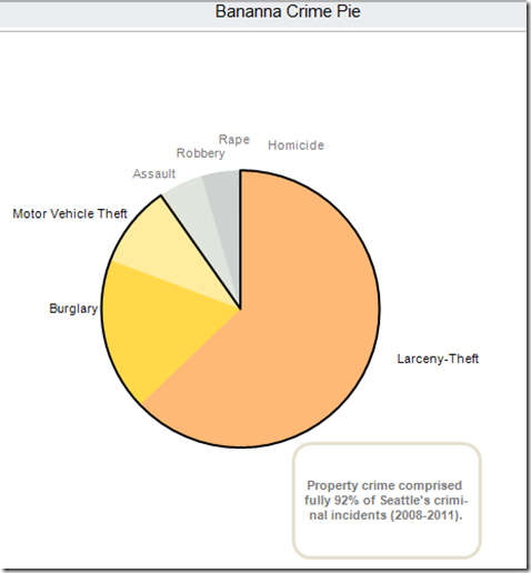
(Data set: Crime stats by precinct, 2008-2011)
This struck me as rather a lot of property crime for an area with such low levels of violent crime, so I tracked down a local Seattle beat cop to get some perspective on it. He told me about an interesting pawn shop sting the Seattle PD ran over the last year to attempt to address the rising property crime levels, named Operation Oliver’s Twist.
Mayor McGinn described Oliver’s Twist in a press conference on 3/6/2012:
(Data set: Police report incident, used for the rest of this blog entry)
(Data transformations: here, you can see how I’ve defined Seattle property crime.)
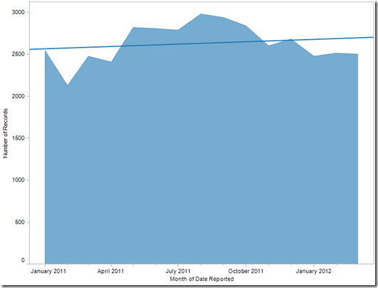
Overall, property crime in Seattle hasn’t decreased since the sting arrests began in (assumed) Feb-March of 2012. In fact, from the regression line, you can see the total number of Seattle property crime incidents has actually increased a little.
Let’s break it down by district to see if we can see decreases in crime closest to the sting pawn shop. I used my data set to cobble together a basic Police District map of Seattle. The SPD pawn shop was located in Georgetown, which is in the light pink “O” district below.

Now we know that districts F, K, M, O, R and W are closest to the SPD pawn shop sting. We might (theory) expect to see property crime decrease most dramatically in those districts. To see the difference, I compared the number of property crime instances in the months of February and March in 2011, to the same period in 2012 (the estimated time of the arrests), in each district.
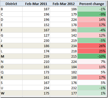
To make these stats a little clearer, let’s graph the change by district on our original district map. The blue circle describes the neighborhood of Georgetown, the location of the sting. Red indicates an increase in property crime incidents, green a decrease. From this map, we can see that the pawn shop location is surrounded by a lot of red – a lot of districts for whom property crime instances actually increased between 2011 and 2012.
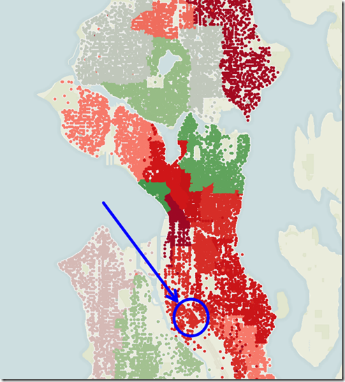
So, working from this data alone, it looks like the “Oliver’s Twist” sting in the O police district has not yet caused a decrease in property crime in neighboring districts.
It’s still possible that arrests are still ongoing, and the positive impact of the sting has yet to fully manifest itself. Looking at a rolling average since the beginning of February, we see that there has been a steady decrease in property crime in Seattle over the last few weeks (though levels still remain higher than this time last year). It’s interesting to note that the drop is substantially more pronounced in districts farther away from our Georgetown pawn shop.
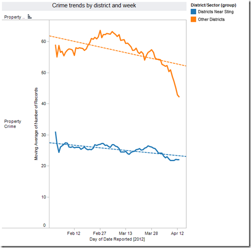
There are a lot of factors at play when it comes to measuring crime rates. How much might property crime rates have grown without this intervention? How have previous large-scale stings in Seattle and other areas impacted overall crime rates? Is it possible that there is a negative relationship between location and property predation? Perhaps criminals fence stolen goods intentionally far from where they grabbed them, and the “Other Districts” category is really the one that contains our signal. All interesting questions for the next intrepid analyst who wants to play in this space.
Here’s an example of how easy it can be to explore a data set when you combine powerful, user-friendly tools like Socrata (which publishes public sector data), and the free version of Tableau (a great visualization tool). To try this analysis out yourself, check out the Seattle Socrata data sets here, and the free public version of Tableau, here.
Property crime is Seattle’s biggest crime sector. When you combine vehicle theft, burglary, and larceny, you get 92% of Seattle’s criminal incidents.
“In 2010, Seattle bucked a national trend of declining property crime rates, with burglary and theft rates here increasing 3.2% in contrast to a 1.3% decrease across the country, according to data from the U.S. Department of Justice’s “Crime in the United States” report.” (article here)

(Data set: Crime stats by precinct, 2008-2011)
This struck me as rather a lot of property crime for an area with such low levels of violent crime, so I tracked down a local Seattle beat cop to get some perspective on it. He told me about an interesting pawn shop sting the Seattle PD ran over the last year to attempt to address the rising property crime levels, named Operation Oliver’s Twist.
Mayor McGinn described Oliver’s Twist in a press conference on 3/6/2012:
[D]etectives from the Seattle Police Department’s Major Crimes Task Force and the Pawn Shop/Property Recovery Unit, working with the King County Prosecuting Attorney’s Office (KCPAO) and the FBI, set up a storefront fencing operation – a tactic not used by SPD since 1979 – where undercover officers spent 11 months buying stolen goods from suspects for pennies on the dollar, with no questions asked.With initial results:
As a result of the operation, detectives identified 102 suspects involved in 314 separate criminal cases. Dozens of suspects were arrested and booked into jail over the last 24 hours on their outstanding cases.The question is: has this operation shown immediate results in reducing Seattle’s property crime?

(Data set: Police report incident, used for the rest of this blog entry)
(Data transformations: here, you can see how I’ve defined Seattle property crime.)
Overall, property crime in Seattle hasn’t decreased since the sting arrests began in (assumed) Feb-March of 2012. In fact, from the regression line, you can see the total number of Seattle property crime incidents has actually increased a little.
Let’s break it down by district to see if we can see decreases in crime closest to the sting pawn shop. I used my data set to cobble together a basic Police District map of Seattle. The SPD pawn shop was located in Georgetown, which is in the light pink “O” district below.

Now we know that districts F, K, M, O, R and W are closest to the SPD pawn shop sting. We might (theory) expect to see property crime decrease most dramatically in those districts. To see the difference, I compared the number of property crime instances in the months of February and March in 2011, to the same period in 2012 (the estimated time of the arrests), in each district.

To make these stats a little clearer, let’s graph the change by district on our original district map. The blue circle describes the neighborhood of Georgetown, the location of the sting. Red indicates an increase in property crime incidents, green a decrease. From this map, we can see that the pawn shop location is surrounded by a lot of red – a lot of districts for whom property crime instances actually increased between 2011 and 2012.

So, working from this data alone, it looks like the “Oliver’s Twist” sting in the O police district has not yet caused a decrease in property crime in neighboring districts.
It’s still possible that arrests are still ongoing, and the positive impact of the sting has yet to fully manifest itself. Looking at a rolling average since the beginning of February, we see that there has been a steady decrease in property crime in Seattle over the last few weeks (though levels still remain higher than this time last year). It’s interesting to note that the drop is substantially more pronounced in districts farther away from our Georgetown pawn shop.

There are a lot of factors at play when it comes to measuring crime rates. How much might property crime rates have grown without this intervention? How have previous large-scale stings in Seattle and other areas impacted overall crime rates? Is it possible that there is a negative relationship between location and property predation? Perhaps criminals fence stolen goods intentionally far from where they grabbed them, and the “Other Districts” category is really the one that contains our signal. All interesting questions for the next intrepid analyst who wants to play in this space.
Remember: all data sets are quirky, and no analyst infallible. Please have your own team confirm these results before basing any big changes on it.
Studying data science is a lot like being a data scientist
Note: Last year I decided to commit to data science as a career. I did this analysis to brush up on some skills, and to show potential employers how I solve problems. It worked like a charm, and I recommend it to new data science people. - K2 - 2013-04-01
Data science is like anything else: the best way to learn to do it is to do it. This is challenging if you’re winging it, because there isn’t a clear path laid out for newbies. There are lots of free / low cost resources out there, but most of them assume some previous knowledge from the other resources. It’s unclear what comes first, which data philosophy an author / instructor is operating on (there are several), or which techniques are most practical in the real world. Thus, learning data science is a lot like doing data science: you start with some half-formed questions, search and slice until you have some half-formed answers, organize them somehow, refine your questions and start again. Making it work curiosity, and a knack for sorting through giant piles of unsorted information and turning it into categories. The good news is: you’re probably already good at that, which is why you’re interested in data in the first place.
The other good news is that I’m going to lay out some of those steps & terms for you here. Personally, it drives me nuts when things are made to seem harder or more forbidding than they have to be. While data science isn’t for everybody, there are way more people out there who would be great at it, than there are people who know they would. The industry is going to need all of us: the ones who know they can do it and the ones who don’t. So, I figure, let’s lower the bar of entry. If each newbie works to make it easier on the next newbie, before we know it there’s an army of us well-poised to ask and answer fascinating new questions about human behavior.
The flip side is that since I’m just getting oriented myself. Collaboration is the steam that makes data science go: if you want to add a resource, step in the process, or advice to this ground-up tutorial series, let me know.
Next: we start by doing. I’ll set you up with a couple of user friendly tools that let you circumvent some (though not all) of the initial technical hurdles, so you can get directly into the fun part: data analysis.
Tuesday, March 27, 2012
No, you’re weird
Ever noticed how most behavioral research is based on studies of Western, upper-middle-class, undergraduate university students? If you, like me, are American, it might never occur to you to wonder whether those results can really be generalized to describe the behavior of "people." After reading The weirdest people in the world? (Western, Educated, Industrialized, Rich and Democratic (WEIRD)), you may want to go back through your favorite studies on decision-making, collaboration, cognition, and symbol interpretation and question your first read.
This paper also has pretty much the best opening paragraph of any academic paper ever. Fair warning: it's not SFW.
Thursday, March 22, 2012
Where’s Gringo?
Because Americans are so geographically isolated, we are often less aware of the signature quirks of our own culture and perspective than are (say) people from patchwork continents like Africa, South America, Europe, The Artist Formerly Known as the Soviet  Union, etc. Our biases hide in plain sight. For a dose of cultural perspective from the comfort of your own beanbag chair, do not miss American Cultural Patterns. I’m told this tiny little book was written as culture-shock prep for undergraduates who were entering the Peace Corps, and were traveling overseas for the first time. It delves deeply into kernel-level cultural assumptions about communication, values, morality, the perception of time and causality - the list goes on. In my experience, reading any three pages of this book provokes an hour of fascinated discussion over the late-night-coffee of your choice.
Statistics in Plain English
Yesterday I picked up Statistics in Plain English, by Timothy C. Urdan, and I tell ya I can't put it down. From my review:
I think I can say, without fear of hyperbole, that this is the best math book in the history of the entire universe. The fact that there are only six reviews of the book so far, instead of six hundred, hints at the fundamental problem I personally see in math education: it looks harder than it is because we communicate so poorly about it. Urdan communicates clearly and naturally, so the chilly math textbook mystique drops away, and you are left with a functional vocabulary of basic stats techniques.
Urdan starts with the assumption that all humans can understand and benefit from statistical techniques. By assuming that, he makes it true. He not only defines every term and every symbol he uses -- which is already amazing -- but the new terms and definitions are summarized at the end of each chapter. He lays out lots of context and many straightforward and interesting examples. The chapters are short, which gives you a nice feeling of accomplishment and plenty of breaks to think. He even humanizes the experience by speaking in the first person, expressing personal preferences, and even cracking the occasional joke. It's like talking about math over tea with a good friend.
In the modern data space, there's a great shortage of people who have a comfortable intuition for stats. If this book were in every undergraduate class, I'd wager that shortage would just go away.
Subscribe to:
Posts (Atom)